German-speaking travelers visiting Egypt often face language barriers, cultural misunderstandings, and unreliable service providers. Despite Egypt's rich cultural heritage and stunning destinations, many German tourists struggle with:
KEMET Reisen needed to establish itself as the premier choice for German-speaking travelers seeking private, authentic, and stress-free Egyptian adventures.
KEMET Reisen came to us with nothing — no logo, no website, no brand language, no digital presence. What they did have was a genuine competitive advantage: a team of licensed, German-speaking Egyptologists operating on the ground in Egypt, offering private tours with no sales stops and no crowds.
The problem wasn't the product. The problem was invisibility.
German-speaking travelers booking Egypt trips had no way to find or trust a small local operator — they defaulted to large German tour aggregators (TUI, DERTOUR) or booked generic English-language operators and accepted the language gap. KEMET Reisen was losing clients who didn't know they existed.
The strategic decision we made early: don't position KEMET as a cheaper alternative to big operators. Position them as the opposite — the insider access that big operators can never offer. Premium, private, personal. "Ihr Ägypten. Unsere Erfahrung."
This shaped every brand decision that followed.
Audience segmentation drove the visual and messaging system. Research identified three emotionally distinct traveler profiles — romantic couples (30–50s) seeking luxury and cultural depth; families with children (8–16) wanting safety, education, and adventure; and culturally-motivated seniors wanting authentic experiences delivered with European service standards. Each segment needed a different emotional entry point, but one unified brand that could speak to all three.
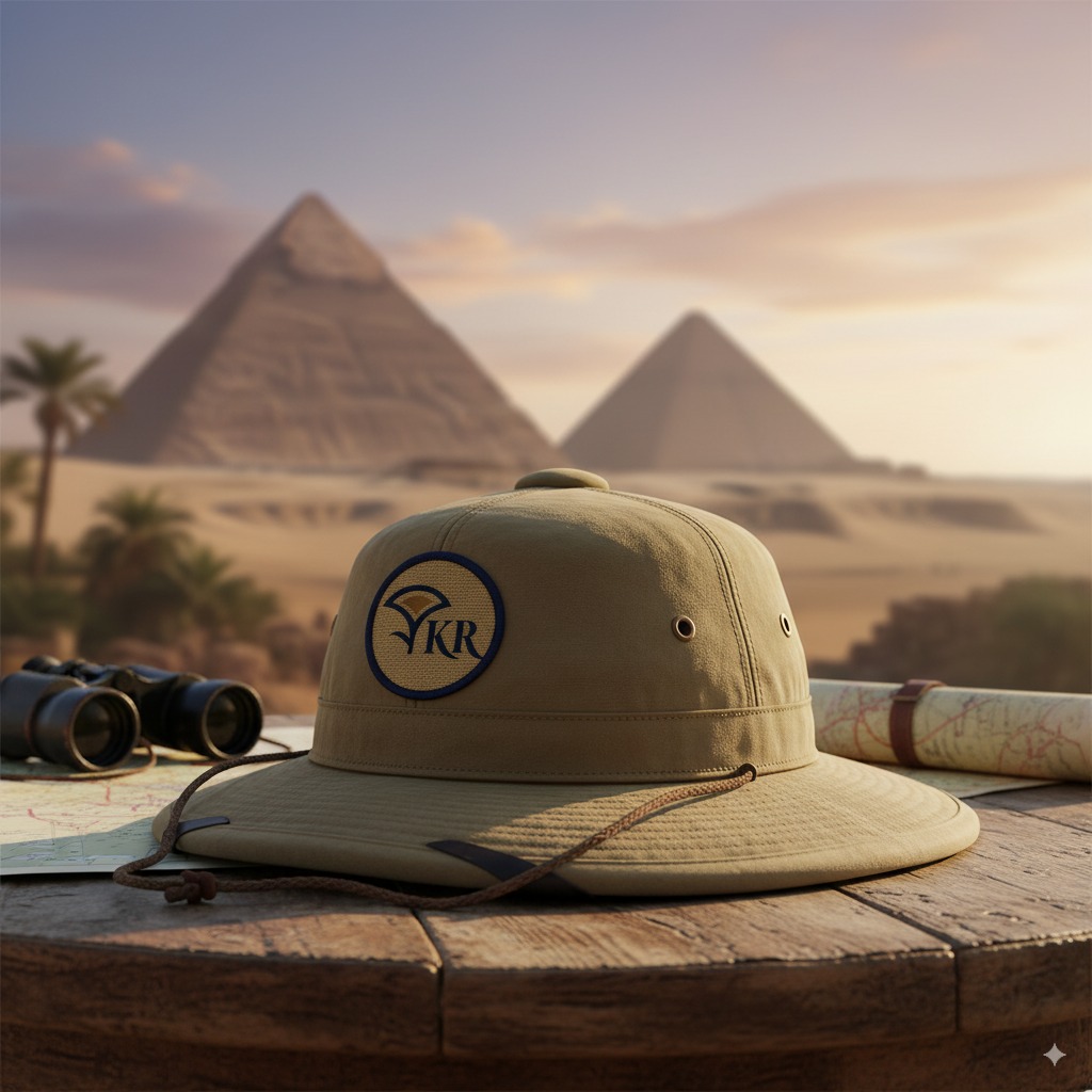
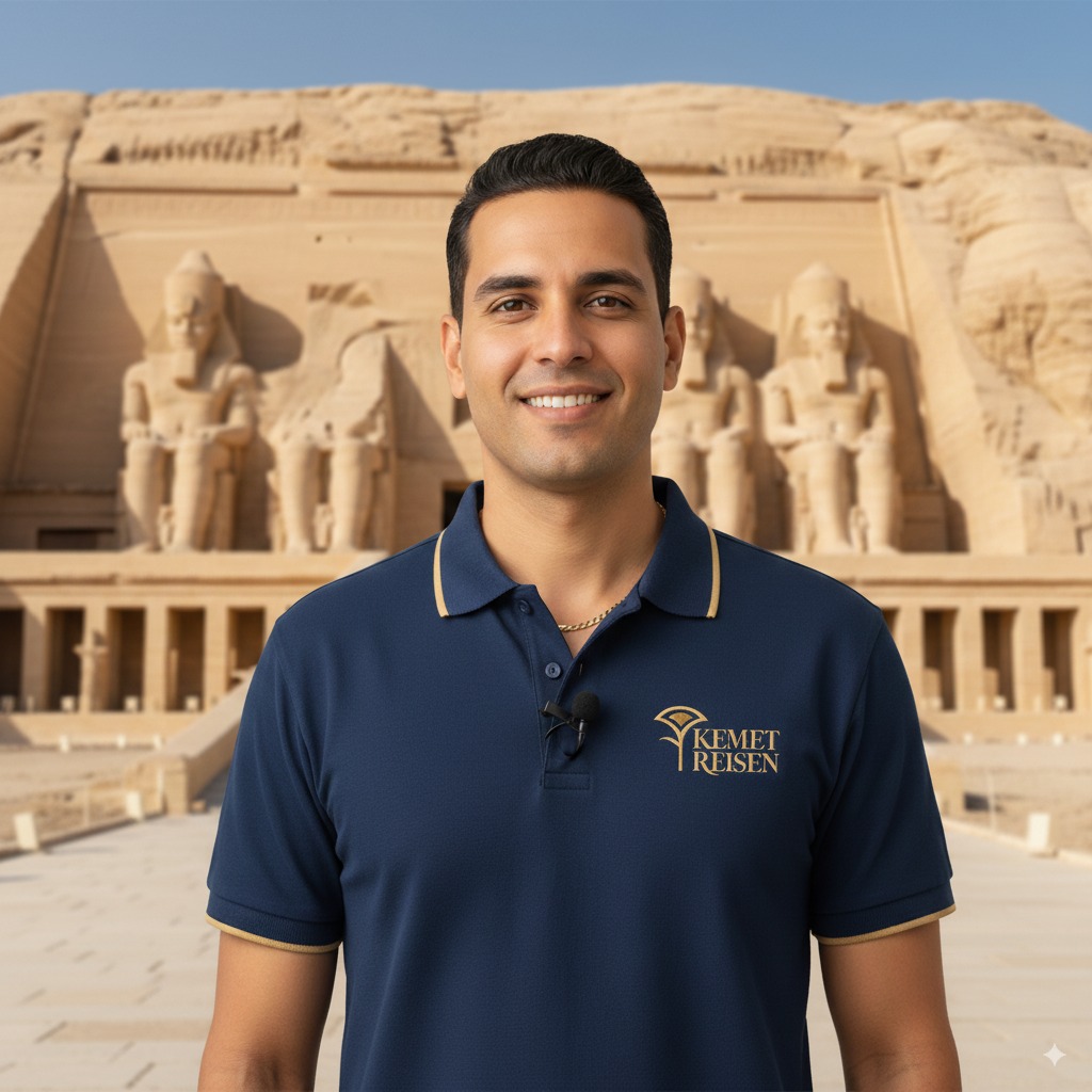
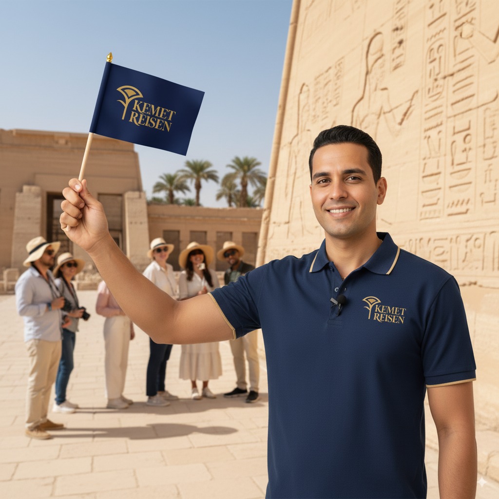
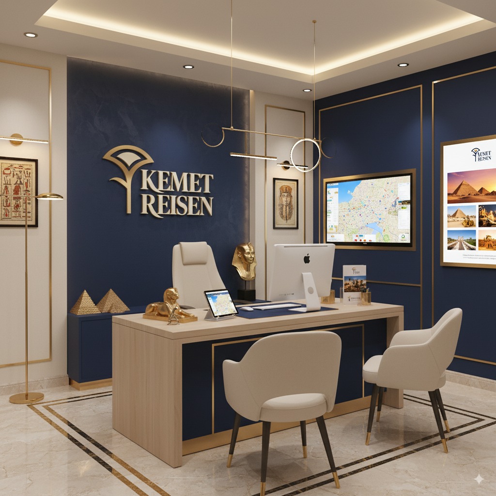
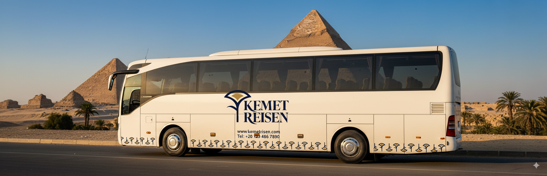
The visual identity was built around a core tension: ancient Egypt meets contemporary German design sensibility. Sand, turquoise, stone, and gold as the palette — warm enough to evoke the Nile and the desert, restrained enough to meet German expectations of credibility and professionalism. The logo combined a papyrus plant (authenticity, cultural roots), Nile-wave custom typography (journey, flow), and a sun element (adventure, the Red Sea). Nothing generic. Nothing that could belong to another brand.
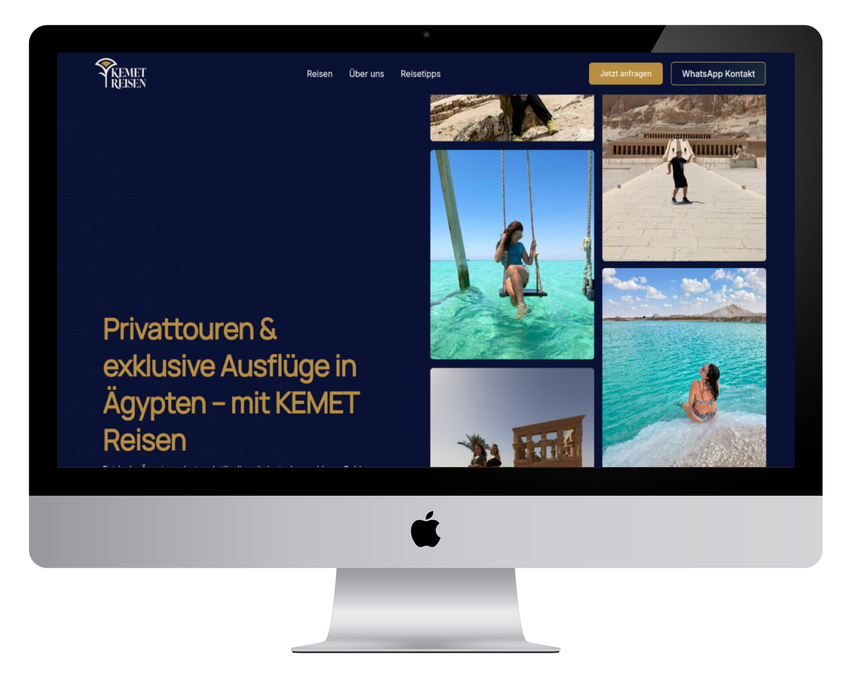
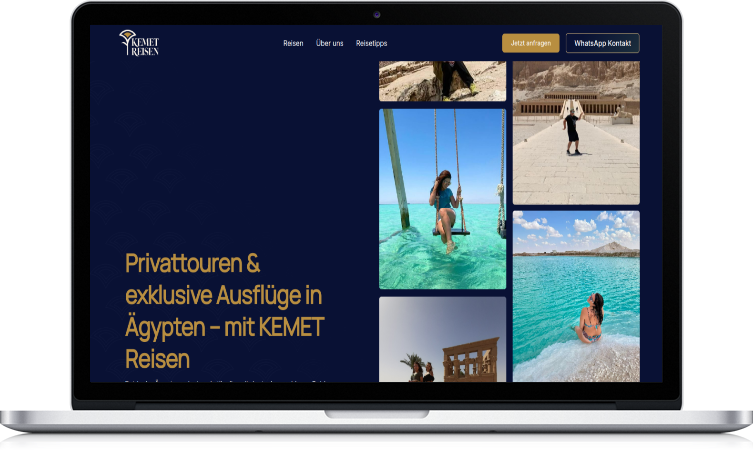
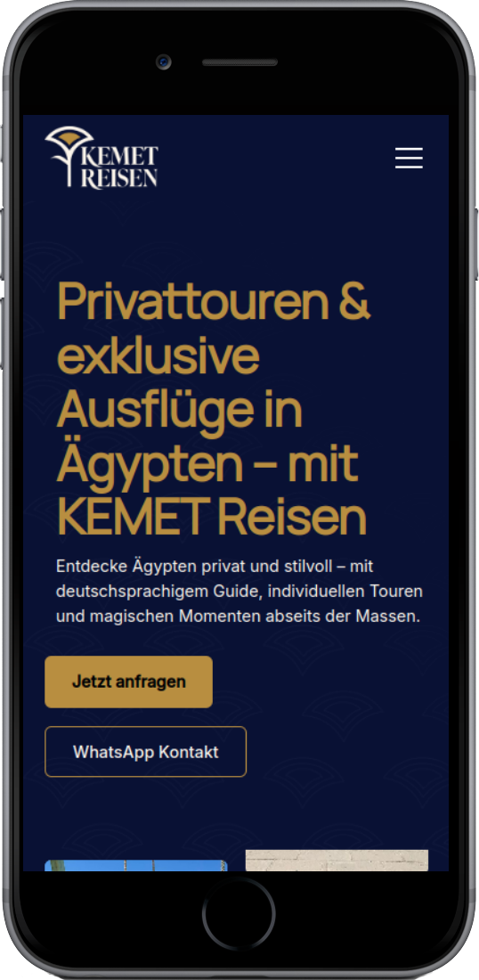
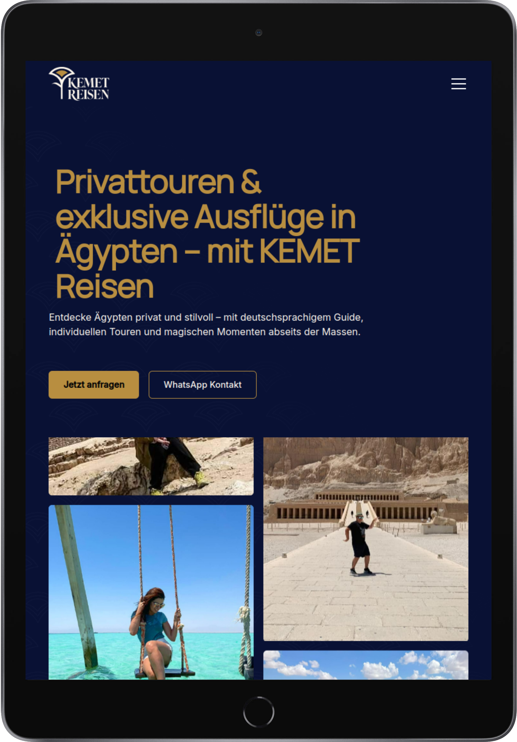
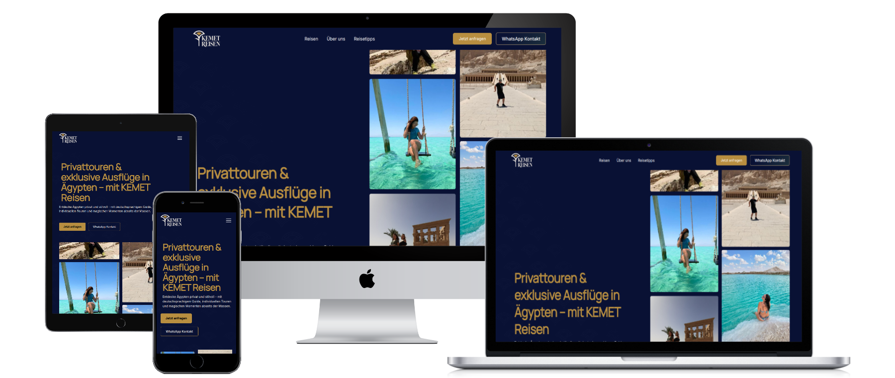
The website was engineered for trust, not transactions. German travelers do not book impulsively — they research, compare, and decide based on credibility signals. The site was structured to demonstrate expertise first and facilitate booking second. WhatsApp as the primary inquiry channel (not a booking engine) was a deliberate strategic choice — it matches how German travelers actually prefer to communicate with specialist operators, and it allows KEMET to build the personal relationship that justifies premium pricing.
The entire brand system — identity, messaging, website, and social launch — was delivered in 4 weeks.
This moodboard captures the essence of KEMET Reisen: a journey through Egypt’s timeless wonders, blending ancient heritage with modern adventure. Warm desert hues, deep blues of the Red Sea, and golden temple tones reflect the brand’s palette of discovery and luxury. Iconic Egyptian symbols and authentic family travel moments highlight the balance between cultural depth and personal experience, embodying KEMET Reisen’s promise of unforgettable, tailor-made journeys.
The visual identity draws inspiration from Egypt's timeless landscapes while maintaining the clean, trustworthy aesthetic expected by German audiences. We used earth tones - sand, turquoise, stone, and gold - to evoke the natural beauty of Egypt's deserts and the Nile.
Key Brand Messages:
The logo design draws directly from ancient Egyptian heritage while capturing the modern adventure spirit. We incorporated the papyrus plant - a symbol deeply rooted in Egyptian culture and history - as the central visual element. The custom-made typography mimics the flowing waves of the Nile River, creating an organic connection between the text and Egypt's lifeblood.
A sun element was strategically integrated to represent the excitement, entertainment, and beach experiences that modern travelers seek. This solar symbol captures both the cultural significance of Ra in ancient Egyptian mythology and the contemporary appeal of Egypt's Red Sea destinations.
Logo Elements:

Created a conversion-focused website that prioritizes trust-building over instant booking. The site features:
You can check the website live HERE.
The brand strategy positions KEMET for ambitious expansion: