Short answer: present the strategy before the logo. Open by recapping the brief and the strategy the client agreed, tell the story behind each concept, then reveal the logo and show it working on real touchpoints. Present three directions with equal depth, recommend one, and ask for a decision against the brief rather than an opinion. Clients who see the thinking first judge the logo on whether it does the job, not on whether they like the colour.
Key takeaways
- Never open with the logo. A logo shown cold gets a reaction to taste.
- Recap the signed strategy first, in the client’s own words where you can.
- Show three directions with the same four slides each, then compare them side by side.
- Show every logo in use: a website header, a sign, a social post, a business card.
- Ask “which direction best fits the audience we agreed?”, not “do you like it?”
- Present live, never by email, and send a written recap within 24 hours.
Why the order of a logo presentation matters
A logo is a small, abstract thing to judge. Without context, people judge it the only way they can: by personal taste, by what their partner thinks, by a colour they dislike. That is how good work gets picked apart in round one.
The fix is the order of the meeting. When the client hears the brief, the audience and the positioning again before they see a single mark, they have a yardstick. The question in the room changes from “do I like it?” to “does this say what we agreed it should say?”, and that is a question you can win with reasoning.
This is Step 2 of the brand identity process. It assumes you ran discovery and have a signed strategy. If you don’t, fix that before you design anything.
Before the meeting
- Know who decides. Ask in advance who will be in the room and who signs off. Presenting to someone who has to “check with my partner” guarantees a second round.
- Don’t send the files first. A PDF opened on a phone between meetings is the worst possible first view. Present live, then send the deck.
- Rehearse the story, not the slides. You should be able to explain each concept in two sentences without looking at the screen.
- Prepare your recommendation. Decide which direction you would choose and why, before the client asks.
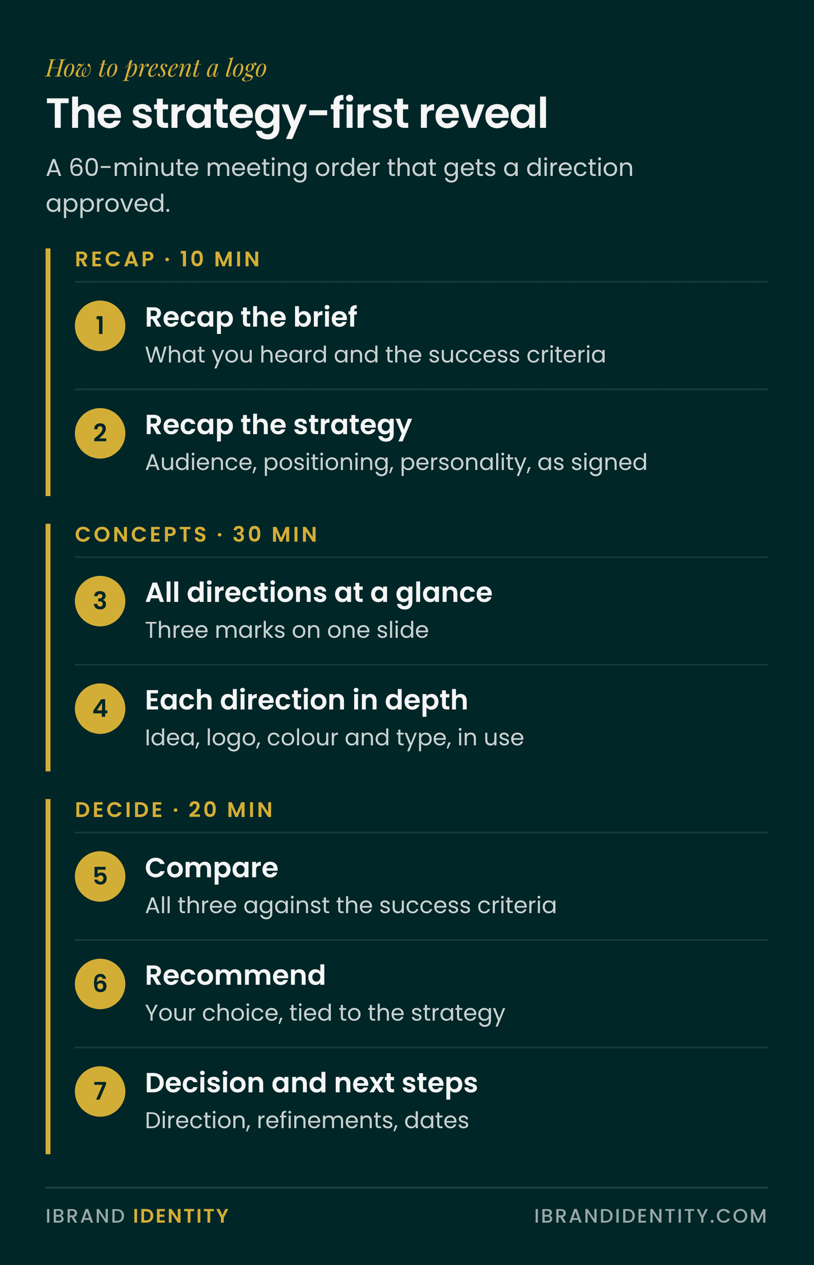
- Book enough time. Sixty minutes for three directions: about 10 for the recap, 30 for the concepts, 20 for discussion and next steps.
How to present a logo: the strategy-first reveal
This is the order we use at iBrand Identity. Each step earns the next one.
- Recap the brief. What you heard, a short quote from the founder, and the two or three success criteria everyone agreed.
- Recap the strategy. Audience, positioning, values and personality, exactly as signed. Use their words where possible.
- Show the directions at a glance. One slide with all three marks small, so the client sees the range before going deep.
- Walk through each direction. Same structure every time: the idea, the logo, colour and type, then the brand in use.
- Compare them side by side. One slide that puts all three against the success criteria.
- Recommend one. Say which direction you would choose and why, tied back to the strategy.
- Ask for a decision and set next steps. Which direction moves forward, what refinements are needed, and the dates.
How many logo concepts should you show?
Three is the common choice for a full identity project. The trade-offs:
| Concepts | Works when | Risk |
|---|---|---|
| 1 | The strategy is very tight and the client trusts you completely | Feels like no choice; a “no” sends you back to zero |
| 2 | Smaller projects with a clear brief | Reads as either-or; clients often ask to merge them |
| 3 | Most identity projects | Needs equal effort on all three, or one looks like filler |
| 5 or more | Rarely | Spreads your time thin and invites a “mix and match” request |
Whatever the number, never show a direction you would be unhappy to deliver. Clients have a talent for picking the one you included to make the others look good.
How to show each concept
Give every direction the same four slides, so the client compares ideas rather than effort:
- The idea. One sentence and one image that explain the thinking: what the mark represents and why it fits the positioning.
- The logo. Large, on a plain background, with the primary lockup and any secondary versions.
- Colour and type. The palette and typefaces that come with this direction, so the logo isn’t judged alone.
- The brand in use. The direction applied to the touchpoints this client actually has: a website header, a storefront or signage, a social post, packaging or stationery.

The fourth slide does more selling than the other three. Most clients can’t picture a logo on a sign or a phone screen; show them, and the decision gets easier. Use mockups of their real touchpoints rather than generic ones.
Handling feedback in the room
Ask questions that point back to the brief
- “Which direction best speaks to the audience we agreed on?”
- “Which one would feel most at home next to the competitors we looked at, and which stands out?”
- “If a new client saw this on your website, which would they trust most?”
Avoid “what do you think?” and “do you like it?”. They invite taste, and taste is the one thing you can’t argue with.
When the client says “I don’t like it”
Ask what specifically isn’t working, then check the answer against the strategy. Sometimes the feedback is right and points to a real miss. Sometimes it’s a personal preference (“I don’t like green”) that the strategy can answer (“green is what separates you from the three competitors who all use navy”). Either way, don’t defend in the moment. Write it down, say you’ll come back with a considered answer, and keep the meeting on track.
When they want to combine two directions
Ask what they like about each. Often it’s a colour from one and a typeface from the other, which can work. Merging two marks rarely does. Offer to explore the specific elements in the refinement round rather than promising a hybrid on the spot.
Presenting a logo remotely
- Share your screen from the presentation software, not a PDF viewer, so you control the pace.
- Ask everyone to turn their cameras on for the reveal. Reactions are half the information.
- Pause after each direction and ask one question before moving on.
- Keep the client off their phone: present first, send files after.
After the meeting
Send a short written recap within 24 hours: the direction chosen, the refinements agreed, and the next date. If the decision is still open, send two or three focused questions instead of the whole deck, and give a date by which you need an answer. Once the direction is final, it flows into the brand guidelines in Step 3. See 10 brand guidelines examples for what good handover documents look like.
Common mistakes
- Leading with the logo. The client reacts before they understand the idea.
- Emailing the concepts. The first view happens without you, on the wrong screen, in the wrong mood.
- Uneven directions. Six slides for your favourite and one for the others reads as a forced choice.
- No mockups. A logo floating on white is hard to judge, so clients default to taste.
- No recommendation. Clients hire you for judgement. Not giving one looks like you don’t have one.
- Ending without a decision. Always leave with a chosen direction or a date for one.
A template for the whole meeting
If you present identities regularly, a fixed deck structure saves hours and makes every reveal more consistent. Our Brand Presentation Template ($39) follows the strategy-first reveal above: 32 slides in five sections (introduction, brief, strategy, three directions and next steps), four slides per direction, a comparison and recommendation slide, and presenter notes on every slide. It works in PowerPoint, Keynote and Google Slides.
Frequently asked questions
How do you present a logo to a client?
Present the strategy before the logo. Recap the brief and the agreed strategy, show all directions at a glance, walk through each one with the same four slides (idea, logo, colour and type, brand in use), compare them against the success criteria, recommend one and ask for a decision.
How many logo concepts should I present?
Three is the common choice for an identity project: enough for a real choice, few enough to give each one proper attention. Give each the same depth and never include a direction you would be unhappy to deliver.
Should I show logo mockups in a presentation?
Yes. Show each direction on the client’s real touchpoints, such as a website header, signage, a social post or packaging. Most clients find it hard to judge a logo on a blank background, and mockups help them judge it in context.
Should I email logo concepts to a client?
Not for the first view. Present live, in person or on a video call, so you can explain the thinking and hear reactions. Send the files after the meeting with a short written recap.
What do I say when a client doesn't like the logo?
Ask what specifically isn’t working and check it against the agreed strategy. Note it, avoid defending in the moment, and come back with a considered answer. Feedback that points to a real miss should change the work; personal preference can usually be answered by the strategy.
How long should a logo presentation be?
About an hour for three directions: roughly ten minutes to recap the brief and strategy, thirty for the concepts and twenty for discussion, a decision and next steps.
Written by Martina Boshra, founder of iBrand Identity and creator of The Transmutation Method™. Brand strategist for founders and service businesses across the US, Europe and the Gulf. Part of the brand identity process guide. Last updated November 2026.