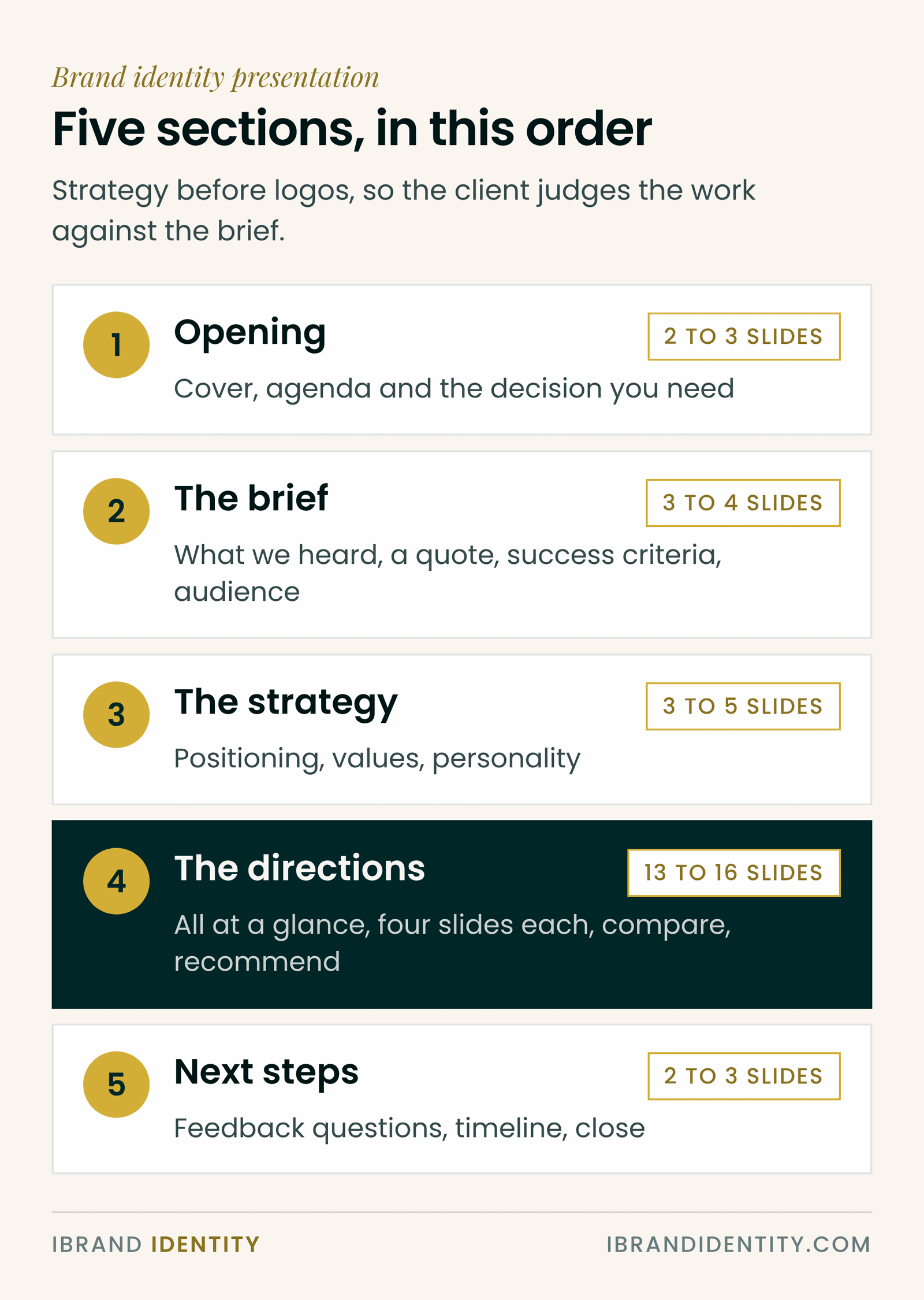
Short answer: a brand identity presentation should run in five sections: opening, the brief, the strategy, the identity directions and next steps. Recap what the client agreed before you show any logo, give each direction the same four slides (idea, logo, colour and type, in use), compare them against the success criteria, recommend one, and end with the decision you need. That usually comes to 25 to 35 slides for three directions.
Key takeaways
- Logos come in the second half. The first half reminds the client what the logo has to do.
- Every direction gets the same slides, so the client compares ideas rather than effort.
- Show the brand on the client’s real touchpoints, not generic mockups.
- Recommend one direction and say why, in the language of the strategy.
- Write presenter notes, so the deck still makes sense when the client forwards it.
The deck at a glance
| Section | Slides | What goes on them |
|---|---|---|
| 1. Opening | 2 to 3 slides | Cover: project name, client, date; Agenda: what the client will see and the decision you need today |
| 2. The brief | 3 to 4 slides | What we heard: the problem in the client’s words; A quote from the founder or a customer; Success criteria: how the identity will be judged; Who it is for: the core audience |
| 3. The strategy | 3 to 5 slides | Positioning: the one sentence the brand stands behind; Values and personality, with is / is not; Personality sliders or a moodboard that sets the tone |
| 4. The directions | 13 to 16 slides | All directions on one slide; For each direction: the idea, the logo, colour and type, the brand in use; Optional: a photo mockup per direction; Comparison against the success criteria; Your recommendation |
| 5. Next steps | 2 to 3 slides | Feedback questions that lead to a decision; Timeline from here to guidelines; Thank-you or closing slide |
The slide counts are a guide for three directions. With two directions the deck gets shorter; with one, the strategy section matters even more, because it carries the whole argument.
Section 1: Opening
Keep it short. A cover with the project name and date, then an agenda slide that tells the client what they’ll see and what you’ll ask them to decide. Naming the decision up front changes how people watch: they start judging against a goal instead of waiting to react.
Section 2: The brief
Play back what you heard during discovery. Use the client’s own words where you can; a quote from the founder or a customer on its own slide is powerful. Then show the success criteria: three to five statements the new identity must meet, such as “feels established enough for corporate buyers”. These are the yardstick for everything that follows.
If you ran a workshop, this section is a summary of its outputs. See our guide to running a brand discovery workshop.
Section 3: The strategy
Recap the signed strategy: the positioning statement, values and personality, and the voice. A personality slider slide works well here, because it turns abstract words into positions the client already agreed. A moodboard can set the tone, but label it as direction, not design.
Section 4: The directions
Start with all directions on one slide, small and side by side, so the client sees the range before the detail. Then present each direction with the same four slides:
- The idea: the concept in one or two sentences, linked to the strategy.
- The logo: the mark large, on a plain background, with nothing else on the slide.
- Colour and type: the palette and typefaces that come with this direction.
- In use: the brand on the touchpoints the client cares about most, such as the website, a social post, signage or packaging.
Close the section with a comparison slide that scores each direction against the success criteria, then your recommendation. Recommend one, and explain it using the strategy, not your taste.
Section 5: Next steps
End with two or three feedback questions that lead to a decision, such as “Which direction best meets the success criteria?” and “What would need to change for it to be final?”. Add a timeline from refinements to guidelines, so the client sees the project continuing. For how to run the meeting itself, see how to present a logo to a client.
Design rules for the deck
- One idea per slide. If a slide needs a paragraph to explain it, split it.
- Neutral styling. The deck should frame the work, not compete with it. Use a quiet palette and one clean typeface.
- Consistent layouts. Same position for headings, same treatment for every direction.
- 16:9 format, which fits screens, video calls and PDF exports.
- Presenter notes on every slide, so a forwarded PDF still tells the story.
- Send a PDF after the meeting, never before. The first viewing should have your voice with it.
Common mistakes
- Opening with the logo. The client reacts to taste before they remember the brief.
- Uneven directions. One polished route and two rough ones looks like a set-up.
- Generic mockups. A logo on a stock coffee cup says nothing about this client’s business.
- No recommendation. Clients hire you for judgement; withholding it feels like hedging.
- No ask. A deck that ends on “Thank you” without a decision slide often ends without a decision.
A ready-made brand presentation
Our Brand Presentation Template ($39) is this structure built out as a 32-slide PowerPoint deck in five sections, each with a divider: the brief, the strategy with values and personality sliders, three logo directions with four slides each, an optional photo-mockup slide, a comparison slide and your recommendation, then next steps with feedback questions and a timeline. Every slide has presenter notes, and it opens in PowerPoint, Keynote and Google Slides.
Frequently asked questions
What should be in a brand identity presentation?
An opening with the agenda, a recap of the brief and success criteria, a recap of the strategy, the identity directions with the same slides for each, a comparison and recommendation, and next steps with the decision you need.
How many slides should a brand presentation have?
For three directions, 25 to 35 slides is typical: about a third for the brief and strategy, about half for the directions, and the rest for comparison and next steps. Fewer directions means fewer slides.
In what order should I present a brand identity?
Brief, strategy, then the directions, then comparison, recommendation and next steps. Showing the strategy first means the client judges the logos against what they agreed, not against personal taste.
Should I show logo mockups in a brand presentation?
Yes, on the client’s real touchpoints. Seeing the identity on their website, signage or packaging helps clients imagine it working. Avoid generic stock mockups that have nothing to do with their business.
Should I send the brand presentation before the meeting?
No. Present it live first so you can tell the story and answer questions, then send a PDF afterwards with presenter notes so it still makes sense when forwarded.
What software should I use for a brand presentation?
Any tool your client can open: PowerPoint, Keynote or Google Slides all work. A 16:9 PowerPoint file is the safest choice, because it opens in all three.
Written by Martina Boshra, founder of iBrand Identity and creator of The Transmutation Method™. Brand strategist for founders and service businesses across the US, Europe and the Gulf. Part of the brand identity process guide. Last updated November 2026.