Short answer: logo usage guidelines tell people which version of the logo to use, how much space to leave around it, how small it can go, which backgrounds it works on and what never to do to it. A complete logo section covers seven things: the logo family, clear space, minimum size, colour versions, backgrounds, placement and misuse, plus the files to use for each. Show every rule with a correct and an incorrect example, and give the reason in one line.
Key takeaways
- Define clear space with part of the logo itself, so the rule scales at any size.
- Give minimum sizes in both millimetres for print and pixels for screen.
- Say which version goes on light, dark and photographic backgrounds.
- Show misuse visually. A page of crossed-out examples prevents more mistakes than a paragraph of rules.
- Hand over the files with clear names, so people never screenshot the logo from a PDF.
The logo usage checklist
| Rule | What to specify |
|---|---|
| Logo family | Primary logo, secondary lockups, icon or monogram, wordmark only |
| Clear space | Minimum empty space on all sides, based on part of the logo |
| Minimum size | Smallest width in mm for print and px for screen, per version |
| Colour versions | Full colour, one colour, black, white (reversed) |
| Backgrounds | Which version on light, dark, brand-colour and photo backgrounds |
| Placement | Preferred positions on common layouts and alongside partner logos |
| Misuse | The changes nobody may make, shown visually |
| Files | Which format to use where, and where the files live |
1. The logo family
Most identities need more than one version. Show each one, name it, and say when to use it:
- Primary logo: the default, used wherever there’s room.
- Secondary lockups: stacked or horizontal versions for tall or wide spaces.
- Icon or monogram: for social avatars, favicons, app icons and small spaces.
- Wordmark only: where the symbol would be too small to read.
Fewer versions are easier to manage. Only include a version if there’s a real place it will be used.
2. Clear space
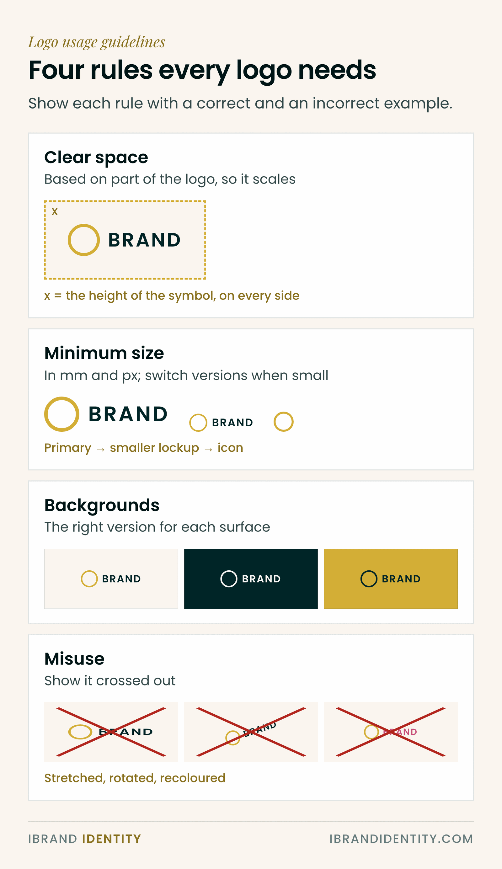
Clear space is the minimum empty area around the logo that no text, image or edge may enter. Define it using a part of the logo itself, such as the height of the first letter or the width of the symbol, and mark it on a diagram. A rule in fixed millimetres breaks the moment the logo is used at a different size.
Clear space is a minimum. More space is almost always better.
3. Minimum size
Below a certain size, details fill in and text becomes unreadable. Test each version at small sizes, on screen and in print, and record the smallest width that still reads clearly. Give it in millimetres for print and pixels for screen, for each version. When the primary logo gets too small, the guidelines should say which smaller version to switch to.
4. Colour versions
- Full colour: the default.
- One colour: for single-colour printing, embroidery or engraving.
- Black: for newspapers, forms and documents printed in black.
- White (reversed): for dark backgrounds and photography.
Link each version to the exact colour codes in the colour section: HEX and RGB for screens, CMYK for print, and Pantone where the client uses spot colours.
5. Backgrounds
Show the logo on the backgrounds people will actually use: white, the brand’s light and dark colours, and a few photographs. Mark which version works on each, and which combinations to avoid. On photographs, the rule is usually to place the logo on a calm, even area and to use the white or black version, never the full-colour one on a busy image.
6. Placement
Placement rules save people from guessing. Show the preferred position on the layouts they make most often, such as social posts, slides, letterhead and signage. If the brand appears with partner or sponsor logos, set a rule for co-branding: equal visual size, a divider or clear space between them, and which logo comes first.
7. Misuse
Show each mistake with the logo crossed out, so it’s recognised at a glance. The common ones:
- Stretching or squashing the logo.
- Changing the colours outside the approved versions.
- Adding shadows, outlines, glows or other effects.
- Rotating or tilting it.
- Rearranging or resizing the parts of the lockup.
- Placing it on a busy background where it can’t be read.
- Putting it inside a shape or container that isn’t part of the design.
- Recreating it in a different typeface.
8. Files to hand over
- SVG for websites and digital use; it stays sharp at any size.
- PNG with a transparent background for documents, slides and social media.
- PDF or EPS for print and signage suppliers.
- Every version in every colour, named clearly, for example brand-logo-primary-white.svg.
- One shared folder that everyone uses, mentioned in the guidelines, so nobody screenshots the logo from a PDF.
Common mistakes
- Rules without reasons. “The logo disappears on red; use the white version” gets followed. “Never use red” gets ignored.
- Clear space in fixed units. It stops making sense at other sizes.
- No small version. People shrink the primary logo until it’s unreadable.
- Too many versions. Every extra lockup is another chance to use the wrong one.
- No files. Rules without the assets create workarounds.
Where this fits
The logo section is one of 13 sections in complete brand guidelines. For the full list, see what to include in brand guidelines, and for how guidelines differ from a style guide or brand book, see brand guidelines vs style guide vs brand book. Both are part of the hand-over phase of the brand identity process.
A ready-made logo system
Our Brand Guidelines Template for designers ($49) includes a complete logo system: the logo family, clear space, minimum size, backgrounds and misuse pages, with linked logo files so you replace the demo logo once and every page updates. It is part of a 66-page guidelines system in 13 sections, in InDesign, Illustrator and PDF, at 16:9, A4 and US Letter. For your own small brand, the free brand guidelines template covers the essentials.
Frequently asked questions
What should logo usage guidelines include?
The logo family and when to use each version, clear space, minimum size, colour versions, which version to use on each background, placement rules, misuse examples, and the file formats to use for screen and print.
How do you define clear space around a logo?
Use a part of the logo itself as the unit, such as the height of the first letter or the width of the symbol, and require at least that much empty space on every side. Because it is based on the logo, the rule works at any size.
What is a logo minimum size?
The smallest width at which the logo still reads clearly. Test it on screen and in print and give it in millimetres for print and pixels for screen. Below that size, switch to a simpler version such as the icon.
What are common logo misuse examples?
Stretching, recolouring, adding effects such as shadows, rotating, rearranging the parts, placing the logo on a busy background, putting it inside an unapproved shape and recreating it in another typeface.
What logo file formats should a client receive?
SVG for websites and digital use, PNG with a transparent background for documents and social media, and PDF or EPS for print, in every version and colour, with clear file names.
How many versions of a logo does a brand need?
Usually three or four: a primary logo, a secondary lockup for tall or wide spaces, an icon for small spaces, and sometimes a wordmark on its own. Each needs full colour, one colour, black and white versions.
Written by Martina Boshra, founder of iBrand Identity and creator of The Transmutation Method™. Brand strategist for founders and service businesses across the US, Europe and the Gulf. Part of the brand identity process guide. Last updated November 2026.